Tampilkan postingan dengan label responsive. Tampilkan semua postingan

Sabtu, 02 Januari 2016

Responsive FooTable With Filter Sort And Paging

Responsive Html Table With Filter Sort And Paging Using FooTable

________________________________________________________


In this FooTable Tutorial we will see How To Create a Responsive Html Table To Display friendly In Desktop , Tablet And Mobile With SortingFilter And Pagination Using FooTable .

I Use In This Tutorial:
- FooTable.
- Php.
- NetBeans IDE .
- XAMPP .
- PhpMyAdmin .


Source Code:

<!-- php code to get data from mysql database -->

<?php

$hostname = "localhost";
$username = "root";
$password = "";
$databaseName = "javaprg";

$connect = mysqli_connect($hostname, $username, $password, $databaseName);
$query = "SELECT * FROM `products`";
$result = mysqli_query($connect, $query);

?>

<!DOCTYPE html>
<html>
    <head>
        <title> Html Table With FooTable </title>
        <meta charset="UTF-8">
        <meta name="viewport" content="width=device-width, initial-scale=1.0">
        <link rel="stylesheet" href="css/footable.core.css">
        <link rel="stylesheet" href="css/footable.metro.css">
        <script src="js/jquery-1.11.3.min.js"></script>
        <script src="js/footable.js"></script>
        <script src="js/footable.paginate.js"></script> 
        <script src="js/footable.sort.js"></script>
        <script src="js/footable.filter.js"></script>
  </head>
    <body>
        
        <!-- data-page-size = number of data to display -->
        <!-- data-XXX-text = text to display in the pagination bar -->
        <input type="text" id="filter"><br><br>
        <table class="footable" data-filter="#filter" data-filter-minimum="4" data-page-size="3" data-first-text="<<" data-next-text=">" data-previous-text="<" data-last-text=">>" >
           <thead>
            <tr>
                <!-- data-toggle = where the toggle icon will appear -->
                
                <th data-toggle="true">Id</th>
                <!-- hide this column in mobile -->
                <th data-hide="phone">Name</th>
                <!-- hide this column in tablet and mobile -->
                <th data-type="numeric" data-hide="tablet,phone">Quantity</th>
                <th data-type="numeric" data-hide="tablet,phone">Price</th>
                <th data-hide="phone">Image</th>
                <th data-type="numeric">Category</th>
            </tr>
            </thead>
            <tbody>
                 <!-- populate table from mysql database -->
            <?php while($row1 = mysqli_fetch_array($result)):;?>
            <tr>
                <td><?php echo $row1[0];?></td>
                <td><?php echo $row1[1];?></td>
                <td><?php echo $row1[2];?></td>
                <td><?php echo $row1[3];?></td>

        <!-- images from folder with the same name as the id + jpg -->
                <td><img src="products/<?php echo $row1[0];?>.jpg" style="height: 115px; width: 170px;"></td>
                <td><?php echo $row1[5];?></td>
            </tr>
            <?php endwhile;?>
            </tbody>
            <!-- the pagination -->
            <!-- hide-if-no-paging = hide the pagination control -->
            <tfoot class="hide-if-no-paging">
            <td colspan="6">
                <div class="pagination"></div>
            </td>
            </tfoot>
        </table>
    </body>
    <script type="text/javascript">
    
      $(document).ready(function(){
         $('.footable').footable(); 
      });
    
    </script>
</html>


///////////////OUTPUT: 


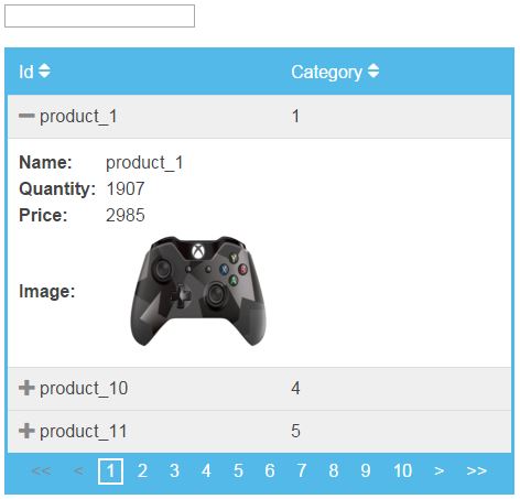
html table using footable
Html Table In Desktop

footable in tablet
Html Table In Tablet

FooTable In mobile
Html Table In Mobile
                                             

Baca selengkapnya

Sabtu, 05 Desember 2015

FooTable Tutorials

                                                     1: Download And Use FooTable


use footable


                                                   2:  Sort Html Table Using FooTable

footable sort


                                        3: Responsive Html Table Using Footable
footable responsive

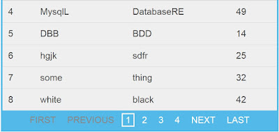
                                4: Create a Pagination In Html Table Using Footable


footable pagination


                                  5: Search And Filter Data In Html Table Using FooTable
footable search


Baca selengkapnya

Responsive Html Table Using Footable

FooTable : How To Create Responsive Html Table Using FooTable

________________________________________________________


In this FooTable Tutorial we will see How To Create a Responsive Html Table To Display friendly In Desktop , Tablet And Mobile  Using FooTable .

I Use In This Tutorial:
- FooTable.
- Php.
- NetBeans IDE .
- XAMPP .
- PhpMyAdmin .


Source Code:

<!-- php code to get data from mysql database -->

<?php

$hostname = "localhost";
$username = "root";
$password = "";
$databaseName = "test_db";

$connect = mysqli_connect($hostname, $username, $password, $databaseName);
$query = "SELECT * FROM `users";
$result = mysqli_query($connect, $query);

?>

<!DOCTYPE html>
<html>
    <head>
        <title> Responsive Html Table Using FooTable </title>
        <link rel="stylesheet" href="css/footable.core.css"> 
        <link rel="stylesheet" href="css/footable.metro.css">
        <script src="js/jquery-1.11.3.min.js"></script>
        <script src="js/footable.js"></script>

    </head>
    
    <body>
        
        <!-- toggle-arrow-alt = icon name -->
        <!-- add toggle-medium for a medium size -->
        <!-- add toggle-large for a large size -->
        
        <table class="footable toggle-arrow-alt">
<thead>
<tr>
            <!-- data-toggle = where the toggle icon will appear -->
<th data-toggle="true">ID</th>
                        <!-- hide this column in tablet and mobile -->
<th data-hide="tablet,phone">First Name</th>
                        <!-- hide this column in mobile devices -->
<th data-hide="phone">Last Name</th>
<th>Age</th>
</tr>
</thead>
        <tbody>

            <!-- populate table from mysql database -->
            <?php while($row1 = mysqli_fetch_array($result)):;?>
            <tr>
                <td><?php echo $row1[0];?></td>
                <td><?php echo $row1[1];?></td>
                <td><?php echo $row1[2];?></td>
                <td><?php echo $row1[3];?></td>
            </tr>
            <?php endwhile;?>

        </tbody>
        </table>
    </body>
    <script type="text/javascript">
     $(document).ready(function(){
         
         $('.footable').footable();
         
     });
    </script>
</html>


///////////////OUTPUT: 


responsive html table in tablet
In Tablet

responsive html table in mobile
In Phone


See more Icon Styles

Baca selengkapnya